User Interface
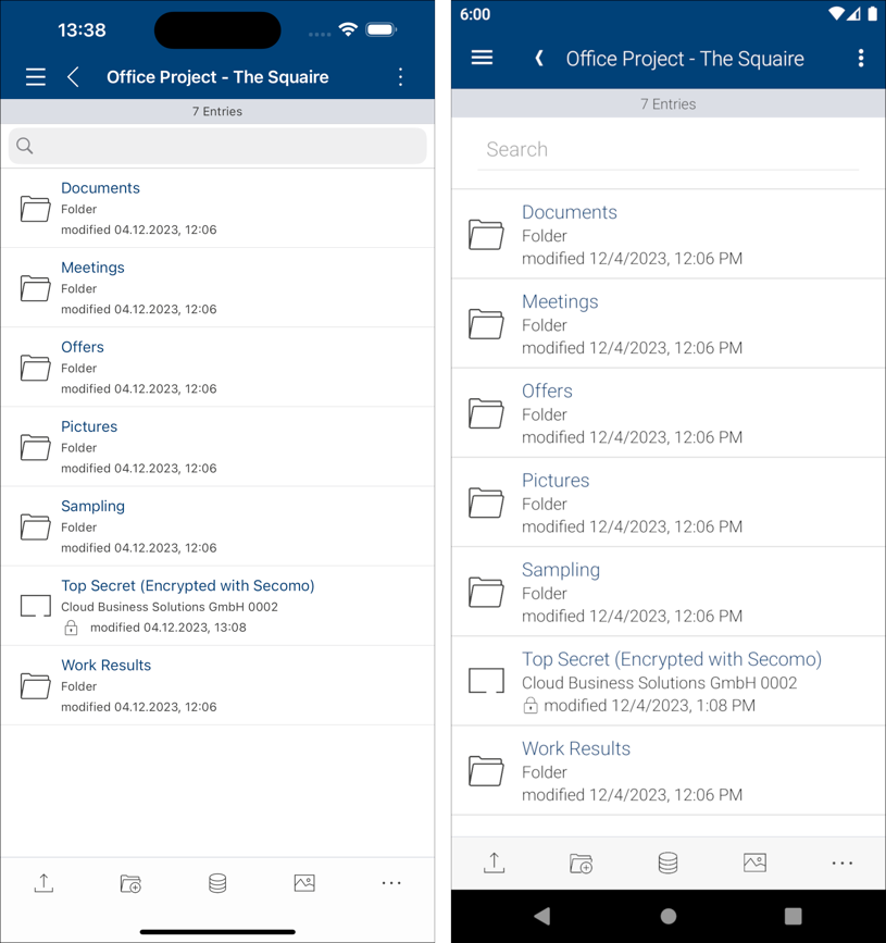
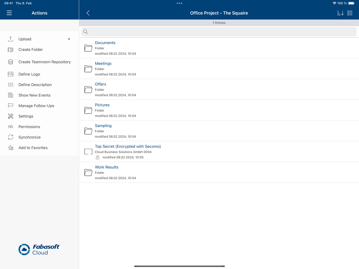
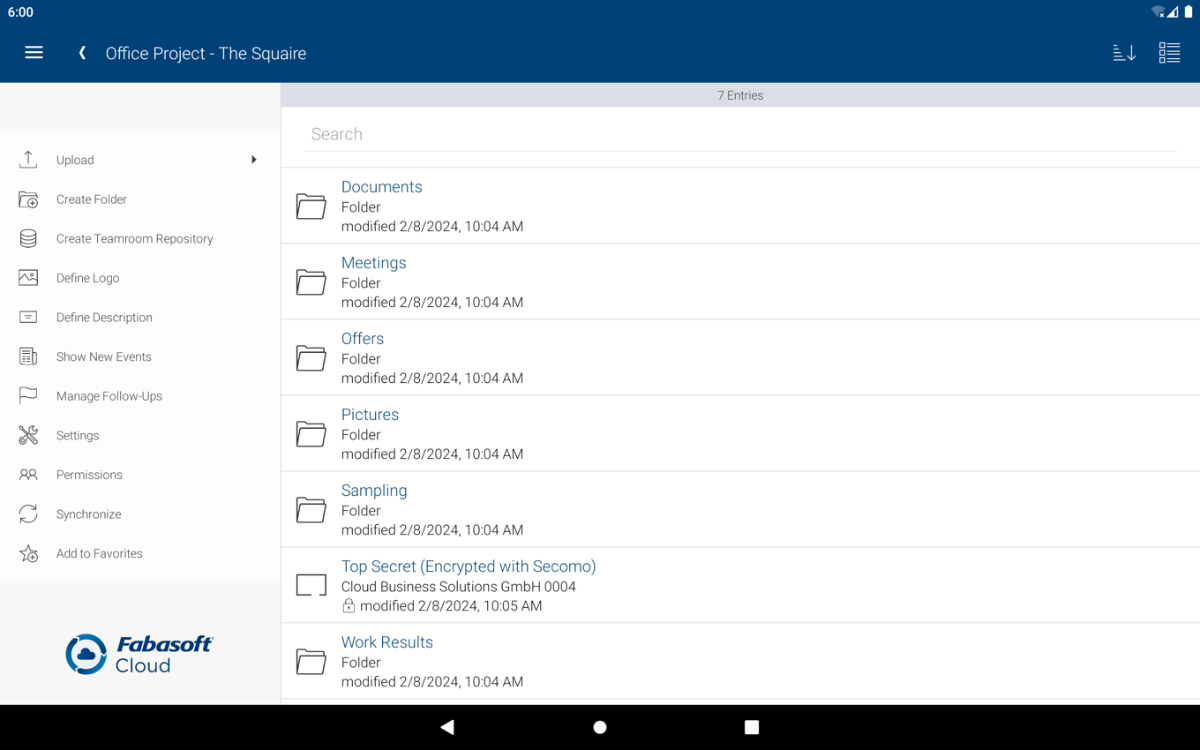
The responsive and accessible user interface is divided into the following areas:
- Title bar
Includes the buttons “Navigation” and “Back” and other action buttons on the right side of the title bar. - Navigation menu
Display your user information and provides direct access to your worklist, synchronized objects, favorites, setting, etc. - Search bar
Allows you to Filter the current list or to search for objects. - Action panel
Allows you to execute actions on the currently displayed object. It is visible below the content area (on phones in portrait mode) or to the left of the content area (on tablets or phones in landscape mode).
The names of the actions in the action panel are only displayed on tablets in landscape mode. Perform a long tap on an action button to display a pop-up with the name and description (if available) of this action.
Note: If the buttons for all available actions do not fit into the action panel, find the additional “More Actions” button. Tap it to see all other actions in a pop-up menu. - Content area
Displays either a list of objects or a preview of documents.
iPhone/Android Phone
iPad
Android Tablet
Note:
- In contrast to the web client the app prefers the language configured on the device for translated texts, as long as the language is supported by the server.
- In order to view the navigation menu, it is necessary to press the hamburger menu icon in the top left corner.


